Visual assets (such as images) have long been used for aesthetic and decorative purposes on the web. They are a fundamental element of website design and are used lavishly to attract the audience’s attention.
But many wonder: Is this the most an image can achieve?
The answer is simple: No!
As businesses rapidly shift towards the online landscape, the elements that were once an essential part of advertising have taken a backseat. The images previously used for beautification purposes are now also critical to boosting the conversion rate of web pages.
Today, business pages, blogs, eCommerce websites, and more rely significantly on visual content to captivate and interact with users. Ultimately, the interaction persuades the audience into becoming consumers of the provided service.
In this guide, let’s look at some ways you can use the power of images to enhance your website’s conversion rate and ensure a fantastic customer experience.
1. Add an Emotional Touch!
Emotions are important, not just in real life but in the virtual world too. Nothing sells faster than what connects to the people at an emotional level.
To touch the sentiments of your target audience, you first have to understand them: Who they are, what are their general preferences, what moves them, etc.
Once you have an idea about their likings, you can easily establish what sentiments you need to evoke in their mind. This will help you curate pictures that target their emotions successfully.
For example, suppose you are a vacation planner. In that case, your pictures for a family holiday deal should mirror different emotions than the pictures you use to sell your honeymoon plans. While the former should signify fun and entertainment, the latter should stir up feelings of romance and love.
2. Use High-Quality Images
The images you use on your website serve as a mirror for your brand. They reflect your credibility and encourage users to trust you. This is why image quality should be taken seriously.
When you add pictures to your website, think about them from a customer’s point of view. If you land on a website with blurry and low-quality images, what would be the first thought to come to mind?
That perhaps the business is not legit or genuine. You would instantly navigate out of the page as well.
Similarly, if a website has high-quality images that are accurately resonating with the text, users are more likely to stay and potentially complete a transaction. Moreover, images that are of good quality also decrease a website’s bounce rate.
3. Allow Users to Zoom In
This tip is significant for online stores or websites that sell products with intricate elements. With an online shop, people don’t have the advantage of seeing the ornate details of a product as they can while shopping physically.
By adding a zoom-in feature to your images, you allow the users to see the products in detail and let them get a virtual feel. When customers can see the specifications of a product clearly, it helps them make the purchasing decision easily.
4. Display 360 Degree Images
Another excellent idea for your eCommerce website would be to add a 360° spin on your images. This feature would enable you to display your products almost life-likely. This approach brings transparency and helps in gaining consumers’ trust.
First-time buyers are often reluctant to purchase goods. However, when they see the product from every angle, they are more likely to get convinced. According to Golfsmith.com, their conversion rate increased some 10 percent after adding this nifty feature to their product advertisement.
The technique is also beneficial if you are selling expensive products online. Viewing the product from various angles clears the doubts present in the consumer’s mind. It shows what the user will get, thus decreasing the return rate.
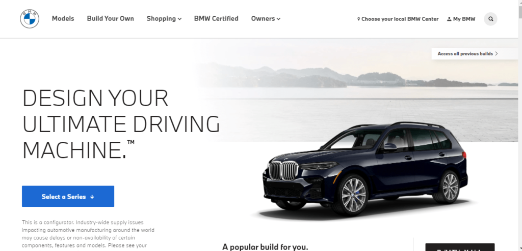
BMW has a dedicated Build Your Own page where users can view the luxurious car from almost every angle. After considering every car feature in detail, people get tempted to book an appointment for a test drive.

5. Use a Mascot
Mascots are another great way of leaving a solid and longer-lasting imprint of your brand on your customers’ minds.
Take, for instance, the email management platform, Mailchimp. Most people recognize the mailing service from ‘Freddie,’ the jolly chimpanzee.

Similarly, you can also develop a likable character and think of attributes that best represent your brand’s message. Then have a mascot designed to serve as your brand’s virtual ambassador.
6. Utilize Stock Photos Smartly
Stock images are comparatively cheap when compared to custom photoshoots. They are also readily available for instant use.
The database of stock photo websites includes an array of visuals, such as photographs, creative icons, illustrations, animated pictures, and more. They not only make your website appear well-crafted but also help boost conversions.
Moreover, you can customize the stock pictures to fit your brand and layout better. You also have the freedom to crop certain parts and integrate texts to make them unique.
This way, you also avoid displaying generic and cliche images that can impact your brand’s credibility.
7. Consider the F and Z Pattern
Do you know the natural eye movement pattern when reading a book? It goes from left to right then comes vertically down. Again, it takes a horizontal move and comes down, forming an F pattern.
The same is the case with website content. We see most of the images placed only in the F path. When we put photos in this route, the chances of engagement increase automatically.
Another effective layout pattern for a website is the Z path. It is perfect for pages that lack information and aims directly to the CTA button. In this case, website owners think people won’t read the entire content, just the key points, and images. Therefore, a CTA image button is present at the end of the Z path.
8. Define Images with the Right Captions
Have you ever seen a CTA image without any surrounding copy? Almost every website image comes with a caption that defines it.
If you don’t add captions, people might comprehend images in multiple ways. Thus, your ultimate objective will spoil.
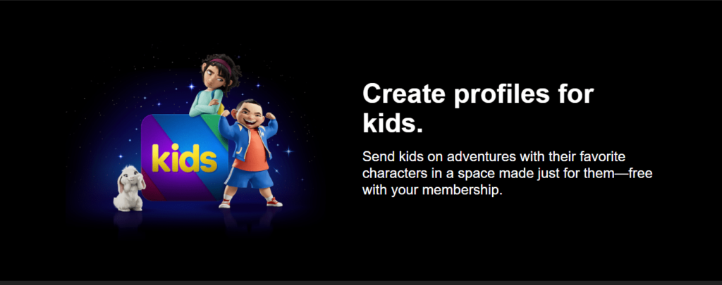
Look at the below example of Netflix:

If there was just a kid’s image, people might think only about the animated kids’ cartoon feature. However, the site refers to creating separate kids’ profiles, mentioned in the caption.
And, the feature is free! The text below the caption further clarifies it. So, to reap the maximum benefit of your site images, make sure to add relevant copy. Short, clear, and attention-grabbing words along with images can hike conversions in no time.
9. Use Adaptive Pictures
When designing your website, it is essential to ensure that your images are adaptive and respond smartly to different screen layouts and resolutions.
For instance, a person navigating your website on a laptop will have a different screen layout than a person using a smartphone.
If your website displays contorted images on a mobile device but has perfect dimensions on a desktop screen, you risk losing customers that use mobile devices to access your website.
This can obviously lead to an increased bounce rate.
Your images should automatically adjust to all screen sizes without getting twisted or losing dimensions to ensure a good conversion rate.
10. Never Ignore the SEO Element
Image SEO can play a huge role in search engine ranking. Getting more visitors is the first step towards more conversions. All other techniques for conversions are useless if there are no visitors.
Therefore, give prime importance to image optimization, along with your traditional SEO process.
Here are some SEO tips for visuals:
Add Alt Text
Alt text refers to a short description of the image. It tells Google what the image is about. Besides this, if the site takes time to load, this text appears before the image. Thus, visitors get to know which image will it be.
Look at the below example:

Wrong Alt Text: Baby reading a book
Correct Alt TEXT: Baby in sea green shirt reading a colorful book
Image Size
Bigger images take more space and affect the website’s loading time. If your site takes too long to load, visitors will switch to the competitor’s site. Therefore, knowing the right size for every image is important.
WordPress users can go through a complete size guideline. It mentions the correct size for banners, featured images, logos, background, etc.
Furthermore, keeping an appropriate size reflects the overall visual page appearance. Crowded pages with so many images and no white spaces can adversely impact visitors. Thus, conversions can go down.
Image Sitemap
The sitemap is a directory that presents the URL of every image along with a short description. When you submit the image sitemap to Google, the algorithms can easily crawl and index your site.
Final Words
While you are saving several costs attached to running a brick-and-mortar store, you should invest generously in making your online presence a strong one.
Using images to upscale your website’s design and catch your audience’s attention is one way to start!
The guidelines mentioned in this article will help you use images in a way that contributes to increasing your website’s conversion rate.
They may seem generic but experimenting with them, keeping your business’s unique requirements in mind will undoubtedly result in the perfect recipe!
About the Author:
Amos Struck is a photo geek having a successful background in sales & digital marketing. He is an entrepreneur and a long-time publisher in the stock imagery industry. Amos has a passion for visual imagery and technology, and he also loves food 🙂

This content is from a contributor and may not represent the views of Tech Help Canada. All articles are reviewed by our editorial team for clarity and accuracy.
Want a heads-up once a week whenever a new article drops?


