Can you tell someone what your business does in a brief yet compelling manner? And would that description pique the interest of the potential customer? Doing these well is crucial, and a marketing one-pager can streamline the process.
What is a Marketing One-Pager?
Marketing one-pagers are single documents containing concise information about a business. Also known as a company one-pager or one-sheeter, its purpose is to inform and entice the customer in a rapid yet compelling manner.
You can think of it as condensing your brand story and product or service information into one effective page. You can use one-pagers as trade show leave-behinds, downloadable resources, and cold and warm outreach.
For example, you can send a one-pager to interested prospects. Similarly, someone interested in working with your business can share it with their colleagues.
The effectiveness of a one-pager lies in its capacity to facilitate rapid understanding and smooth the buyer’s journey.
How to Build a One-pager For Your Brand
A blend of aesthetic appeal, engaging content, and strategic structure is required.
While one-pagers vary based on specific objectives and audience needs, most have a top, middle, and bottom section. Let’s go over each.
Top Section
The purpose of this area is to grab attention, similar to what we do with landing pages. It can contain the following details.
- Your headline: Craft an attention-grabbing headline that encapsulates your offering or the content of the one-pager.
- Sub-headline: You may want to provide something brief that supplements the headline, such as a tagline or company motto.
- Logo: Ensure your company logo is visible to establish a brand association.
Middle Section
The primary purpose of the middle is to provide information that engages and informs the prospect. This section is where you can include any of the following.
- Key features: List the critical features of your product or service concisely.
- Benefits: Align features with clear, relatable benefits that can solve your target audience’s pain points.
- Social proof: Trust or credibility factors like testimonials or client logos. You can also include these at the bottom of your marketing one-pager.
Bottom Section
The goal of this section is to drive action. This is where you should include any of the following.
- Call to action (CTA): Clearly state what you want the reader to do next. For example, Learn More, Book Now, Schedule A Call, Shop Now, Call Today, etc.
- Contact information: Include an accessible way for the prospect to reach out, such as an email address or phone number.
- Social media icons: Add the handles and icons of any social media platforms you use.
Design Considerations
Visual appeal is often as vital as content. Here are some things to keep in mind.
- Simplicity: Keep the design clean and focused to enhance readability.
- Consistency: Use fonts, colors, and styles consistently for a cohesive visual experience.
- Accessibility: Ensure the text is legible and color contrasts adhere to accessibility standards.
- Quality: All elements, especially visuals, should be high quality and represent your brand professionally.
Content Nuances
Your words should quickly guide the potential customer from initial interest to action. It’s about being concise and to the point while ensuring you grab and hold attention.
Here’s a closer look at some vital components.
- Language: Use straightforward, relatable language. Avoid jargon unless it’s necessary and applicable.
- Value proposition: Ensure your unique value is clear and compelling. For example, “We’re your local trusted expert, specializing in grading and hydroseeding” could become “Create lush, even lawns quickly and efficiently.”
- Problem-solution dynamics: This refers to a fundamental approach to addressing challenges, where you identify and analyze a problem and then devise solutions. In the context of a marketing one-pager, highlight the issues your brand solves and explain how you do it.
Marketing One-Pager Examples
Here are some one-sheeter examples to inspire your design.
altMBA

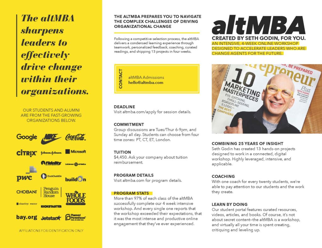
This marketing one-pager for Seth Godin’s altMBA exudes professionalism and clarity. The headline immediately grabs attention, emphasizing the core value proposition: refining leadership skills to drive organizational change.
What’s particularly great is the integration of renowned brands for social proof that builds the program’s credibility. Seth Godin’s strategically positioned image on the right also reinforces trust and authority — since he’s a recognized figure in the marketing and business domain.
Overall, the visual and textual harmony is great, creating a compelling case for the altMBA program. The emphasis on ‘learning by doing’ and the statistics provided bolster its persuasive power, making it an exemplary representation of effective marketing collateral.
Tech Help Canada’s One-pager

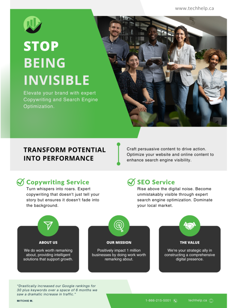
This simple marketing one-pager champions a powerful message: “Stop Being Invisible.” The vibrant green banner immediately catches the eye, driving home the urgency of the company’s value proposition.
The use of a group photo showcases a diverse, approachable team, engendering trust and depicting a sense of unity. Distinct sections also clearly outline services, and the descriptions focus on the transformation the brand promises. The client review is a good touch to boost credibility.
Overall, the one-pager effectively merges visual appeal with articulate messaging, making a compelling pitch to potential clients.
Mercedes-Benz

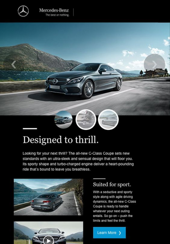
This marketing material exudes luxury and performance. The visual imagery, capturing the C-Class Coupe against a breathtaking landscape, communicates a sense of freedom and grandeur.
The headline, “Designed to thrill,” succinctly encapsulates the essence of the car. The description elaborates on this by emphasizing the vehicle’s sleek design and turbo-charged engine, promising an exhilarating driving experience.
Furthermore, the section “Suited for sport” underlines the car’s athletic prowess, appealing to those with a penchant for dynamic driving. Overall, the material masterfully blends the brand’s hallmark luxury with a promise of unmatched performance, making it a captivating pitch for potential buyers.
Going Beyond
Here are some great ways to make your one-pager stand out.
Integrate Digital Enhancements
Consider embedding digital enhancements, such as clickable links and QR codes.
QR stands for Quick Response. These codes are two-dimensional barcodes that can store information, usually in the form of alphanumeric characters. All the consumer has to do is scan the QR code with their smartphone camera or use a scanner app to access the data.
Some ideas for digital enhancements include:
- Add a video link that provides additional or supporting information.
- Use a QR code to give people access to important pages or info. For example, a local tattoo shop could use it to provide people with their addresses and directions. Similarly, a realtor can send potential buyers to their property lists. “QR codes are great. They allow us to share critical business details without sending an actual email,” says staff at Vidd Studios, a Photography Studio and Creative Services brand in Los Angeles.
- You could also integrate Augmented Reality (AR). For example, a design agency could use AR to show customers what a particular solution might look like in their hands.
Seamlessly incorporating digital elements can make your one-pager more interactive.
Tailor for Various Platforms and Audiences
Tailoring your one-pager for specific platforms and distinct audience segments can heighten the relevance and impact of your message. You could also optimize the digital version of your one-sheeter for various devices (mobile, tablet, and desktop).
B2B vs. B2C Customizations
While overlapping in some areas, B2B and B2C audiences have distinct motivations and triggers.
For a B2B audience, your focus should be imparting the value proposition and benefits of working with your brand. B2C one-pagers should tap more into emotional appeals, utilizing captivating visuals and highlighting immediate benefits. However, this is not to suggest that you can’t go for emotional appeal when dealing with a B2B audience.
Refine and Adapt
Maintain a continuous cycle of refining and adapting based on various feedback mechanisms. The business environment, market dynamics, and consumer behavior are constantly changing. What resonates with your audience today might not have the same impact tomorrow.
What Your One Pager is NOT
It’s essential to have a clear understanding of your marketing one-pager’s purpose and limitations.
Let’s clear up what this tool isn’t.
- Not a spec sheet: It isn’t a deep dive into technical details. Think of it more as a teaser, giving potential customers a taste of the benefits and USP without overwhelming them with specifics.
- Not a company history: This isn’t the space for a trip down memory lane. Keep the focus on what you offer now and how it benefits the reader.
- Not a case study: While studies dive deep into specific scenarios, you should take a broader approach. Highlight your main selling points without getting bogged down in the nitty-gritty.
- Not a total data dump: Less is more. A one-pager is about curating the essential info, not flooding your audience with every detail. Focus on sparking curiosity, not answering every possible question.
- Not a detailed proposal: Think of your one-sheeter as a flirty wink, not a marriage proposal. It’s there to pique interest and set the stage for deeper conversations.
- Not an instruction manual: It’s about highlighting possibilities, not a step-by-step guide. Your aim? To inspire and motivate readers to take the next step.
Pitching With Your One-Pager
Your one-pager serves as a tangible representation of your brand’s value. Here’s how to leverage it effectively online and offline.
Pitching In-Person
- Tailored approach: Customize your one-pager to resonate with the specific interests and needs of your target audience. Highlight how your offering addresses their unique challenges.
- Engage and involve: While discussing, use the one-pager as a visual reference. Direct their attention to pertinent sections, ensuring they remain engaged.
- Leave behind and follow-up: After your discussion, leave the one-pager with them. It acts as a tangible reminder of your proposition and a point of reference for subsequent interactions.
- Support your story: Let your one-pager amplify the narrative. Every element should complement your verbal pitch, providing a coherent picture of your brand’s value.
Pitching Online
Here are some ways to maximize the impact of your marketing one-pager during online pitches.
- Embed in presentations: Start your video call with a slide of your one-pager. This sets the stage, offering a snapshot of what you bring to the table.
- Interactive elements: Make parts of your one-pager clickable. Link to testimonials, case studies, or short videos that can provide a deeper dive when appropriate.
- Direct sharing: Use screen-sharing features to walk through your one-pager in real-time, allowing you to highlight key areas while discussing.
- Send ahead of time: Before your scheduled meeting, email the one-pager as a pre-read. It preps your audience, making the discussion more productive.
- Make it downloadable: Post-pitch, consider providing a link where they can download various digital copy formats, such as PDF, JPG, PNG, Docs, etc. This can help ensure they can easily share it with other stakeholders and have a permanent reminder of your proposition.
- Follow-up with context: When sending post-meeting emails, use the one-pager as a reference, highlighting sections that align with what was discussed.
- Cold and warm email outreach: Send the one-sheeter as an attachment that compliments your email pitch.
Tools to Help You Create Your Company One Pager
These days, you don’t need to be a graphic design guru to design marketing assets. With some modern tools, you can whip up something practical.
Canva and Jasper AI make a good combination.
Canva
This is a game-changer for people who aren’t design experts. It’s packed with design templates you can easily tweak to match your brand’s vibe. The platform is also straightforward to use.
Jasper
If content is where you’re stuck, Jasper can be your best buddy. This AI-powered tool can help you draft initial content so you’re not staring at a blank page for hours. You can even tweak its output to ensure the tone and message aligns with your brand.
Putting It All Together
- Kick-off with content: Start by using Jasper to draft your primary messages and CTAs. Once you have a draft, you can fine-tune it to ensure everything is on-brand and speaks directly to your audience.
- Shift to design: With your content ready, Canva comes into play. Choose a design template that will work for your brand. It should also have a layout that can guide the customer smoothly from start to finish.
- Blend and sync: Your final one-pager should have its design and content meshing well. It should feel like part of your brand’s family, consistent with other marketing materials.
Wrapping Up
A well-crafted one-pager can set you apart. Leveraging user-friendly tools like the ones above can simplify the process immensely. Remember, the goal is to have a one-pager that effectively communicates, resonates with your audience, and aligns with your brand’s aesthetic.

Gabriel Nwatarali is a copywriter, SEO expert, and the founder of Tech Help Canada. He helps founders attract the right kind of search traffic through SEO strategy, content that ranks, and conversion-focused copy. In one project, a single copy tweak helped a brand increase downloads from a few hundred to 10M+. Want a second set of eyes on your site? Reach Out Here
Want a heads-up once a week whenever a new article drops?


