
In the digital age, a fast mobile website is more than just a convenience—it’s necessary. As more users access websites via smartphones, the expectation for quick and seamless browsing experiences has never been higher. A slow-loading site can lead to frustrated users, increased bounce rates, and lost conversion opportunities.
This guide will provide detailed, actionable steps to ensure your mobile site is as fast as possible and caters to users and search engines.
Steps to Have a Fast Mobile Site
Here is a detailed guide to ensure your mobile site runs at optimal speed. Follow these essential steps to enhance performance and deliver a faster, more responsive user experience.
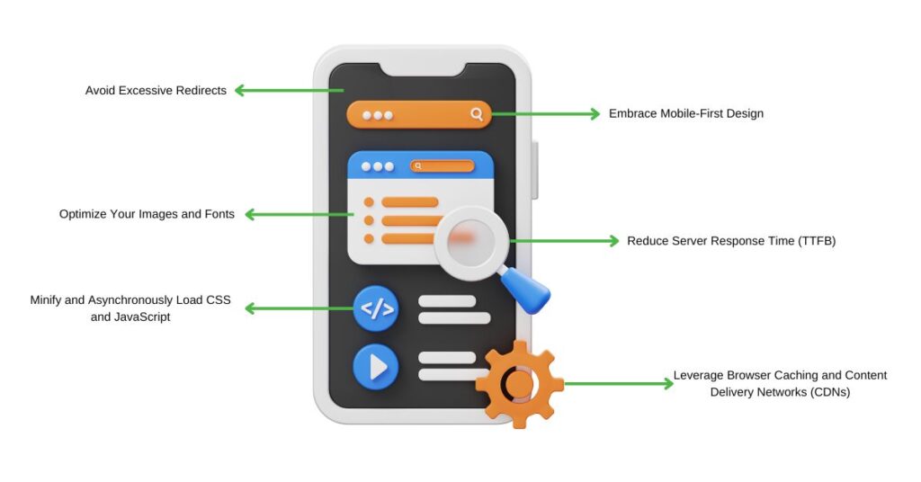
1. Embrace Mobile-First Design
Designing your website with a mobile-first approach means prioritizing the needs of mobile users right from the start. Unlike desktop-first designs later adapted for mobile, mobile-first designs are inherently streamlined and optimized for smaller screens. This method ensures that all elements on the site are necessary and functional on mobile devices.
When you design with mobile in mind, you reduce unnecessary elements that could slow down your site. This includes large images, heavy animations, and complex layouts better suited for larger screens. Instead, focus on simplicity—clean layouts, straightforward navigation, and minimalistic design elements. Doing so creates an efficient and fast mobile site that delivers content quickly and effectively to mobile users.
Responsive design is a critical component of a mobile-first approach. It allows your website to adjust dynamically to different screen sizes and orientations. Google favors responsive designs to ensure a consistent user experience across all devices. Moreover, responsive designs eliminate the need for separate mobile and desktop sites, reducing the maintenance workload and improving site speed.
2. Optimize Your Images and Fonts
Images are often the most significant elements on a webpage; unoptimized images can severely slow down your site’s load time, impacting the fast mobile experience. To optimize images for mobile, start by resizing them to the appropriate dimensions. Large, high-resolution images are unnecessary for mobile devices and can be significantly downsized without losing noticeable quality. Aim to keep images within the 640 by 320-pixel range, maintaining a 4:3 aspect ratio as a general rule.
Compression is another critical step. Use tools that can reduce image file sizes without compromising quality. Formats like WebP offers superior compression compared to traditional JPEG or PNG formats, making them an excellent choice for mobile websites. Additionally, consider using vector images (SVGs) for logos and icons, as they are scalable without losing clarity and typically have smaller file sizes.
Fonts also affect your site’s performance. Web fonts can be heavy and slow to load, mainly if multiple styles and weights are used. To optimize, limit the number of font styles and character sets you load. Stick to the essentials, and consider using system fonts already installed on most devices, which can significantly reduce load times.
3. Minify and Asynchronously Load CSS and JavaScript
CSS and JavaScript files are integral to your website’s functionality but can also be a source of bloat if not correctly optimized. Minification removes unnecessary characters from these files—such as spaces, line breaks, and comments—without affecting their functionality. This reduces the file size, leading to faster load times.
Asynchronous loading allows your CSS and JavaScript files to load simultaneously with other site elements rather than waiting for one file to load before moving on to the next. This can significantly improve perceived load times, as users can interact with the site while other elements are still loading in the background. To implement asynchronous loading, modify how these files are referenced in your HTML code, ensuring that non-critical scripts do not block the rendering of your page.
Another important aspect is reducing the use of render-blocking resources. These files prevent your site from displaying content until it is fully loaded. By deferring non-critical JavaScript and inlining critical CSS, you can ensure that your site renders content more quickly, providing a better user experience and enhancing the fast mobile experience.
You may also be interested in: JavaScript SEO: Rendering, Crawlability, and What Still Matters
4. Leverage Browser Caching and Content Delivery Networks (CDNs)
Browser caching is a powerful tool for improving load times, especially for repeat visitors. When users visit your site, their browser stores elements like images, CSS files, and JavaScript in its cache. On subsequent visits, the browser can load these elements from the cache rather than download them again, speeding up the loading process.
To leverage browser caching, you can set expiration dates for different types of content. For example, static assets like images and CSS files can be cached longer, while dynamic content can have shorter cache durations. This improves load times and reduces the load on your server.
Content Delivery Networks (CDNs) take caching a step further by distributing your site’s content across multiple servers worldwide. When a user accesses your site, the content is delivered from the server closest to their location, reducing latency and speeding up load times. CDNs are particularly beneficial for websites with a global audience, as they ensure consistent performance regardless of the user’s location.
5. Reduce Server Response Time (TTFB)
Time to First Byte (TTFB) is a crucial metric that measures the time it takes for a user’s browser to receive the first byte of data from your server. A high TTFB indicates that your server is slow to respond, which can lead to longer load times and a poorer user experience.
To reduce TTFB, start by optimizing your server settings. Use GZIP compression to reduce the size of the files your server sends and ensure that your server is configured to handle your site’s specific needs. Choosing a reliable hosting provider is also essential. Shared hosting plans, while affordable, can result in slower response times due to multiple sites sharing the same resources. Upgrading to a Virtual Private Server (VPS) or a dedicated server can provide better performance and faster response times.
Additionally, consider implementing server-side caching, which allows your server to store a static version of your website and deliver it to users without generating the page from scratch each time. This can significantly reduce TTFB and improve overall site speed.
6. Avoid Excessive Redirects
Redirects are essential, primarily when pointing users from an old URL to a new one. However, each redirect adds an extra HTTP request-response cycle, increasing page load time. This delay can be even more pronounced when users are on a mobile device due to potentially slower network speeds.
To minimize the impact of redirects, ensure your website is free from unnecessary or broken redirects. Regular audits should be conducted using tools like Google Search Console or third-party SEO tools to identify and eliminate redundant redirects. Limit the redirect chain to just one hop when setting up necessary redirects. For example, avoid redirecting from URL A to URL B and from URL B to URL C. Instead, direct URL A straight to URL C. This approach reduces the overall load time and enhances the user experience.
Additionally, consider the impact of mobile-specific redirects. In some cases, you may have set up redirects to different versions of your site based on the user’s device (e.g., from a desktop site to a mobile site). Replace these with responsive design solutions that eliminate the need for separate URLs; this speeds up load times and simplifies your site management.
Need help with any of this? Contact us today!
Bonus Tips to have a Fast Mobile Site
Here are some extra tips to boost your mobile site’s speed further. These advanced techniques can help you achieve lightning-fast load times and a smoother user experience.
1. Implement Lazy Loading
Lazy loading is an effective technique that defers the loading of images and videos until needed. This means that content “below the fold” (i.e., not immediately visible to the user when the page first loads) is only loaded when the user scrolls down. Implementing lazy loading can significantly reduce the initial load time of your mobile site, as the browser doesn’t need to download all the media files at once.
By only loading what the user needs, you can decrease the perceived load time, making your site feel faster and more responsive. This is especially important on mobile devices, where bandwidth may be limited. Many content management systems (CMS) and website builders offer plugins or built-in features for lazy loading, making it easy to implement without extensive coding knowledge.
2. Prioritize Above-The-Fold Content
When a user visits your site, the content that appears first on their screen—known as “above-the-fold” content—should load as quickly as possible. This improves the user experience and gives the overall impression of a faster site. To prioritize this content, ensure that the HTML, CSS, and JavaScript required to display it are loaded first. This can be achieved by directly inlining critical CSS in the HTML document and deferring non-essential JavaScript until after loading the page.
Another strategy is to minimize the number of elements and resources that need to load above the fold. For instance, avoid placing large images or heavy scripts at the top of your page. Instead, immediately focus on delivering essential content, such as text and buttons, and load additional elements as needed. This approach can dramatically improve your site’s perceived speed, especially on mobile devices, contributing to a fast mobile site.
3. Optimize Time to First Byte (TTFB)
While server response time (TTFB) was discussed earlier, it’s worth noting that some additional strategies can help optimize this metric. One approach is to use a high-performance DNS (Domain Name System) provider. A slow DNS can add unnecessary delays to translating a user’s domain request into the server’s IP address. By choosing a fast, reliable DNS provider, you can shave precious milliseconds off your TTFB.
Optimizing your database queries and ensuring that your database server is adequately powerful can reduce TTFB if your site relies on a database. For large, complex websites, consider using database caching or employing a service like Redis or Memcached to store frequently accessed data in memory, thus reducing the time it takes to retrieve it from the database.
4. Regularly Monitor and Test Your Site
Speed optimization is not a one-time task but an ongoing process for maintaining a fast mobile site. Use tools like Google PageSpeed Insights, GTmetrix, or Pingdom to regularly analyze your site’s load times and receive actionable recommendations for improvement.
Testing your site across different devices and network conditions is also essential. What works well on a high-speed desktop connection might not perform as well on a mobile device with a slower connection. By simulating various environments, you can identify and address potential bottlenecks before they affect your users. Regular testing allows you to keep up with changes in technology and user behavior, ensuring your site remains fast and efficient.
Speed is Essential for a Seamless Mobile Experience
A fast mobile website is crucial today. From embracing mobile-first design principles to optimizing images, fonts, and server response times, the steps outlined in this guide will help you create a site that loads quickly and provides a smooth, enjoyable experience for your users.
By adopting these strategies and routinely testing your site, you can stay ahead of the competition and ensure your audience remains engaged. Remember, in mobile browsing, speed is a necessity.

I can suggest related Tech Help Canada articles based on the topic you’re reading now.

We empower people to succeed through practical business information and essential services. If you’re looking for help with SEO, copywriting, or getting your online presence set up properly, you’re in the right place. If this piece helped, feel free to share it with someone who’d get value from it. Do you need help with something? Contact Us
Want a heads-up once a week whenever a new article drops?


