
Responsive website SEO: how your design affects Google rankings
More than half of worldwide web usage now happens on mobile devices. StatCounter reported mobile at 51.51% of worldwide platform share in June 2026, ahead of desktop at 47.12%. That means many customers meet your business first on a small screen, often before they ever see the desktop version of your site.
Google sees your site that way too.
Google’s mobile-first indexing means the mobile version of your content is the main version Google uses for indexing and ranking. If your desktop site is polished but your mobile experience is slow, stripped down, hard to tap, or missing key content, you’re asking Google and customers to judge your business from the weaker version.
Responsive website SEO connects those two expectations. Responsive design uses the same URL and the same HTML for every device, then uses CSS to adapt the layout to the screen. It keeps your content, links, metadata, structured data, and authority in one place while making the experience work across phones, tablets, laptops, and desktops.
Responsive design doesn’t automatically make a site rank. A responsive site can still be slow, cluttered, inaccessible, or thin. But when responsive design is implemented well, it removes technical SEO problems that often come with separate mobile sites and gives your content a better chance to perform.
If you’re already thinking about mobile website design, responsive SEO is the next layer. It’s the difference between a site that resizes and a site Google can crawl, render, and evaluate without extra technical ambiguity.
Mobile led worldwide platform share in June 2026.
Only about half of mobile origins passed all Core Web Vitals in May 2026.
Mobile friction makes already-common ecommerce abandonment worse.
A practical responsive SEO launch and audit checklist.
Explore the responsive SEO guide
Jump to mobile-first indexing, responsive design trade-offs, Core Web Vitals, ecommerce impact, audit steps, tools, myths, and the checklist.
- What responsive website SEO means
- How Google evaluates mobile sites
- Responsive design vs. separate mobile URLs
- Why is responsive web design important for SEO?
- Responsive design and Core Web Vitals
- The mobile SEO mistakes responsive sites still make
- Responsive design ecommerce: rankings are only half the story
- How responsive website SEO affects content
- How to audit responsive website SEO
- Responsive SEO checklist
- Tools for responsive website SEO
- Common myths about responsive design and SEO
- What to fix first
- Build for the version Google and customers use first
Contents
What responsive website SEO means#
Responsive website SEO is the practice of designing and optimizing a responsive website so it performs well in search. It connects design decisions with technical SEO, mobile usability, performance, accessibility, content parity, and conversion.
The mistake is treating responsive design as a visual issue only. A site can pass a quick “looks fine on my phone” check and still create SEO problems. It may load oversized desktop images on mobile. It may hide important content behind accordions that aren’t implemented well. It may rely on JavaScript Google can’t render quickly. It may have layout shifts, tiny tap targets, missing metadata, or a mobile menu that blocks users from finding priority pages.
Responsive SEO asks a sharper question: can Google and users get the same value from the mobile version that they get from the desktop version?
You may see this described as responsive design SEO, responsive SEO, SEO responsive design, or SEO and responsive web design. The wording changes, but the core question is the same: does your responsive site give Google and mobile users a complete, fast, usable version of the page?
That includes:
| Responsive SEO area | What it affects |
|---|---|
| Mobile-first indexing | Which version of your content Google primarily evaluates |
| Same URL structure | Link equity, canonical signals, redirects, sharing, analytics, and crawl efficiency |
| Content parity | Whether mobile pages include the same important content, headings, metadata, images, links, and structured data |
| Core Web Vitals | Loading speed, interaction responsiveness, and layout stability |
| Mobile usability | Readability, tap targets, spacing, menus, forms, and checkout |
| Rendering | Whether Google can load your CSS, JavaScript, images, and responsive layout |
| Conversion | Whether mobile visitors can finish the task that brought them there |
Responsive web design is the foundation. Responsive website SEO is how you make that foundation work for rankings and revenue.
How Google evaluates mobile sites#
Google recognizes three main mobile configurations: responsive design, dynamic serving, and separate URLs.
Responsive design uses one URL and one HTML document, then adapts the layout with CSS. A product page, service page, or article has the same address on every device.
Dynamic serving uses one URL but sends different HTML depending on the user’s device. The server detects the device and changes what it sends.
Separate URLs use different addresses for desktop and mobile, often with an `m.` subdomain such as `m.example.com`.
Google’s documentation recommends responsive design because it’s the easiest mobile configuration to implement and maintain. It also reduces the number of things that can go wrong. You don’t have to maintain separate URLs, sync canonical tags, manage alternate tags, or redirect mobile users to a separate version.
Mobile-first indexing raises the stakes. Google says it primarily uses the mobile version of a site’s content for indexing and ranking. That doesn’t mean desktop no longer matters for users. It means the mobile version can’t be treated as a lightweight companion to the primary site.
For business owners, the practical rule is clear: the mobile version must be complete.
Your mobile pages should include the same primary content, headings, internal links, metadata, structured data, images, video, reviews, product information, and calls to action as desktop. The layout can adapt. The experience can be simplified. But the value shouldn’t disappear.
Responsive design vs. separate mobile URLs#
Separate mobile URLs used to be common. They made sense when mobile browsers were limited and desktop sites were too heavy to adapt. Today, they create more SEO complexity than most businesses need.
The differences are easier to see in a table:
On smaller screens, this table becomes a stacked reference view.
| SEO factor | Responsive design | Separate mobile URLs |
|---|---|---|
| URL structure | One URL per page | Desktop and mobile URLs for the same content |
| Link equity | Consolidated into one page | Can fragment if signals aren’t handled correctly |
| Crawling | Google crawls one version | Google may need to crawl and process multiple versions |
| Canonical handling | Simpler | Requires correct canonical and alternate setup |
| Redirects | Usually fewer redirects | Often requires device-based redirects |
| Analytics | Simpler reporting | Traffic can split across URLs |
| Maintenance | One page template to improve | Two versions to keep aligned |
| Risk | Lower technical complexity | Higher risk of mismatch, redirect errors, and duplicate content problems |
This doesn’t mean separate mobile URLs are impossible to manage. Large teams can manage them correctly. But for most small businesses, service companies, publishers, and ecommerce stores, responsive design is the lower-complexity SEO path.
The fewer versions of a page you maintain, the easier it becomes to keep your content accurate, your signals consistent, and your user experience aligned.
Why is responsive web design important for SEO?#
The benefits of responsive web design come from consolidation and consistency. Search engines can evaluate one URL, users can share one URL, and your team can improve one version of each page instead of maintaining separate desktop and mobile paths.
The advantages of responsive web design become clearer when you compare it to older mobile setups.
Responsive design supports SEO by reducing technical friction. It doesn’t replace content quality, authority, or search intent. It helps those things work without being weakened by mobile implementation problems.
Your authority stays on one URL#
Every backlink pointing to a page sends signals to that page. With responsive design, all links point to the same URL. A blog article, service page, category page, or product page keeps its authority in one place.
With separate mobile URLs, the signals can become harder to manage. Google can consolidate signals when canonical and alternate annotations are correct, but the setup has more moving parts. A mistake in canonical tags, redirects, sitemap entries, hreflang, or internal links can split or confuse signals.
The issue gets sharper if you’re investing in link building. You don’t want earned links scattered across duplicate mobile and desktop versions when one responsive URL can carry the value.
Your crawl budget goes further#
Crawl budget is the amount of crawling Googlebot can and wants to do on your site. Small sites usually don’t need to obsess over it, but crawl efficiency matters more as a site grows.
Responsive websites are easier to crawl because each page has one URL and one HTML version. Separate mobile sites can multiply the number of URLs Google needs to process. They can also create redirect paths where desktop pages send mobile users or Googlebot smartphone to mobile-specific URLs.
That extra complexity can slow discovery, especially on large ecommerce sites, publisher archives, faceted navigation, or sites with many outdated redirects. If your site already has crawl issues, responsive design helps reduce the surface area.
Tech Help Canada’s guide to crawl budget goes deeper on when crawl efficiency becomes a problem and what to fix first.
Duplicate content is easier to avoid#
Duplicate content isn’t always a penalty problem, but it can create confusion. If the same content exists on desktop and mobile URLs, Google needs clear canonical signals to know which URL should be treated as the main version.
Responsive design avoids that issue by keeping one URL. There’s no mobile duplicate to canonicalize. There’s no `m.` version to sync. There’s no separate set of internal links to maintain.
If your site already struggles with duplicate content, responsive design won’t fix every duplication issue, but it removes one common source of technical clutter.
Redirect problems shrink#
Separate mobile sites often rely on redirects. A desktop URL detects a mobile user, then sends that user to a mobile URL. That setup can break in several ways.
A page can redirect to the wrong mobile equivalent. A mobile page can redirect back to desktop. Old redirects can chain through multiple URLs. Some pages may have no mobile equivalent at all. Users may share one version while search engines index another.
Google can follow redirects, but redirects add complexity and delay. Responsive design keeps the user and Googlebot on the same URL, which removes a whole class of redirect mistakes.
If your site has legacy redirects already, review them carefully. A responsive redesign is a good time to remove outdated paths and reduce unnecessary hops.
Analytics and testing become simpler#
Responsive sites make measurement easier. One URL means one page to track, one conversion path to analyze, and one set of improvements to test.
Separate mobile URLs can split performance data. The desktop version might look healthy while the mobile version quietly underperforms. Or the mobile page might carry most of the traffic but fewer backlinks. That split makes reporting harder and can hide problems until revenue drops.
Responsive SEO gives you a clearer view of the page itself. If the mobile experience underperforms, you can compare device segments without wondering whether two different URLs are muddying the data.
Responsive design and Core Web Vitals#
Core Web Vitals use field data to measure user experience signals: loading, responsiveness, and visual stability. They’re part of Google’s page experience systems, but they aren’t a magic ranking lever. Google has been clear that page experience works alongside content relevance, usefulness, and other signals.
Still, Core Web Vitals matter because they affect users first. Slow and unstable pages lose people. Over time, that can show up in weaker conversions, fewer earned links, and poorer performance against similar pages that give users a smoother experience.
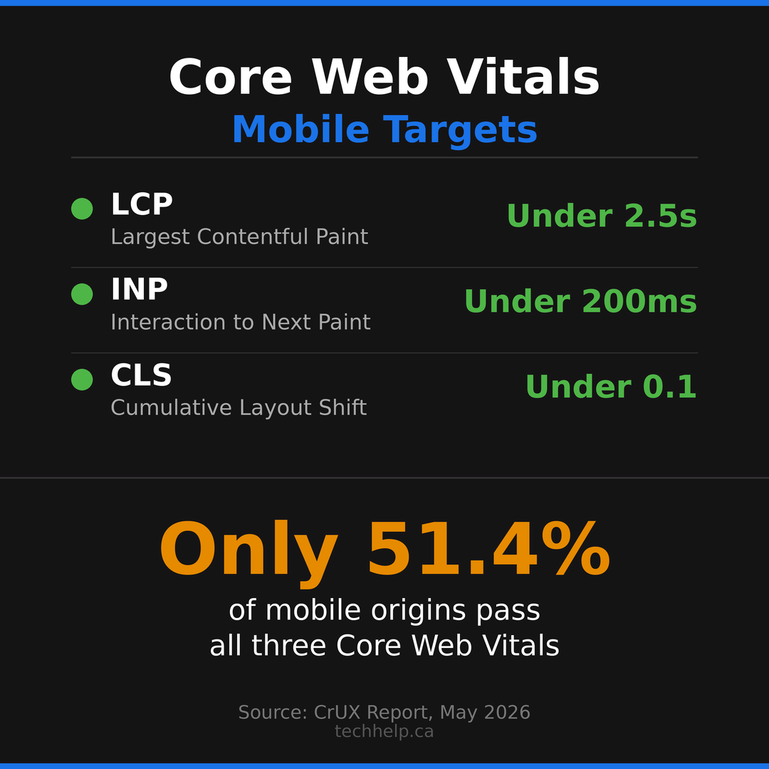
Google’s current Core Web Vitals are:
On smaller screens, this table becomes a stacked reference view.
| Metric | What it measures | Good threshold |
|---|---|---|
| Largest Contentful Paint (LCP) | How quickly the main content appears | 2.5 seconds or less |
| Interaction to Next Paint (INP) | How quickly the page responds to user interactions | 200 milliseconds or less |
| Cumulative Layout Shift (CLS) | How stable the layout is while loading | 0.1 or less |
These thresholds are measured at the 75th percentile of page loads. That means you can’t optimize only for perfect lab conditions. Your page needs to perform well for actual users on actual devices and networks.
HTTP Archive’s CrUX report for May 2026 shows 51.4% of mobile origins passing all three Core Web Vitals. Desktop performed better at 58.9%. That difference is why responsive website SEO has to be tested on mobile, not only inside a desktop browser.
 Preview image
Responsive design influences each metric.
How responsive design affects LCP#
LCP often depends on the largest image, hero block, or main content section in the viewport. Responsive design affects LCP through image sizing, font loading, CSS delivery, server response time, and the order in which critical content loads.
A common mistake is serving a large desktop hero image to every device. A phone doesn’t need a 2400-pixel image if the visible display area is much smaller. Responsive images using `srcset`, `sizes`, modern formats like WebP or AVIF, and correct image dimensions can reduce wasted bytes and improve LCP.
The key isn’t only compression. It’s serving the right asset for the screen and connection.
How responsive design affects INP#
INP measures how responsive a page feels after the user interacts with it. Heavy JavaScript, bloated themes, complex menus, third-party scripts, chat widgets, sliders, and tracking tags can all delay response.
Responsive sites often accumulate JavaScript because every device gets the same code. If your mobile users download scripts meant only for desktop interactions, they pay the performance cost anyway.
To improve INP, remove unused JavaScript, delay noncritical scripts, simplify mobile menus, reduce third-party tags, and test interactive elements on physical phones. A page that looks responsive but responds slowly still feels broken.
How responsive design affects CLS#
CLS measures layout movement. On responsive sites, layout shifts often happen when images load without reserved dimensions, ads inject late, cookie banners push content down, fonts swap after text appears, or responsive breakpoints rearrange content after the page starts rendering.
Set width and height attributes on images, reserve space for embeds and ads, avoid inserting content above existing content, and test sticky elements across breakpoints. The user shouldn’t lose their place because the page moved under their finger.
Need help finding the responsive design issues that are slowing down rankings, leads, or sales?
The mobile SEO mistakes responsive sites still make#
Responsive design solves some problems, but it doesn’t protect you from poor implementation. These mistakes are common because they happen inside otherwise modern-looking websites.
Hiding important content on mobile#
Your mobile page should provide the same primary value as the desktop page. Google doesn’t need your mobile layout to look identical, but the important content should be present and accessible.
Mobile-first indexing exposes weak responsive work. If a desktop service page has detailed service descriptions, testimonials, FAQs, internal links, pricing context, and schema, but the mobile version hides or removes half of it, the mobile version is the version Google primarily evaluates.
Accordions and tabs aren’t automatically a problem. They can improve mobile usability when they’re implemented correctly. The problem is removing content entirely or making it inaccessible to users and search engines.
Serving oversized images#
Images are one of the easiest places to waste mobile performance. A responsive layout can shrink an image visually while still forcing the user to download the full desktop file.
Use responsive image markup and generate multiple image sizes. Add width and height attributes. Compress images. Use lazy loading where appropriate, but avoid lazy loading the main LCP image if it delays the content users came to see.
For ecommerce, the stakes are higher. Product pages and category pages often carry many images, and every oversized file slows the buying path.
Missing the viewport meta tag#
The viewport tag tells mobile browsers how to control page dimensions and scaling. Without it, a mobile browser may render the page at desktop width and scale it down, forcing users to pinch and zoom.
The standard tag looks like this:
<meta name="viewport" content="width=device-width, initial-scale=1">The viewport tag is small, but it affects the entire mobile experience. It should be present on every responsive page.
Blocking CSS, JavaScript, or images#
Google needs access to the resources required to render the page. If your `robots.txt` blocks CSS, JavaScript, or images, Google may not see the responsive layout correctly.
This can happen after a redesign, staging migration, plugin change, firewall rule, or overly aggressive bot-blocking setup. The page may look fine to you in a browser while Google sees an incomplete version.
Use Search Console’s URL Inspection tool to check rendered HTML and screenshots. If Google can’t load your layout resources, fix that before worrying about smaller optimizations.
Designing tap targets for desktop fingers#
Small buttons, cramped links, tiny checkboxes, and crowded menus make mobile pages harder to use. They may not create a direct ranking penalty by themselves, but they damage the experience users have after clicking from search.
Mobile controls need spacing. Forms need clear labels. Menus need predictable behavior. Error messages need to help users recover. Checkout and booking flows need larger inputs and fewer distractions.
If users mis-tap, zoom, back out, or abandon, the page failed its mobile job.
Letting popups block the task#
Popups can be useful, but mobile popups often become blockers. Cookie notices, newsletter prompts, discount offers, app banners, chat widgets, and location prompts can stack on top of each other until the user can’t read the page.
Google has guidance around intrusive interstitials, and users have even less patience. If an interruption appears before the user gets value, it creates resistance. Delay nonessential prompts, make them easy to close, and never let them cover the main action.
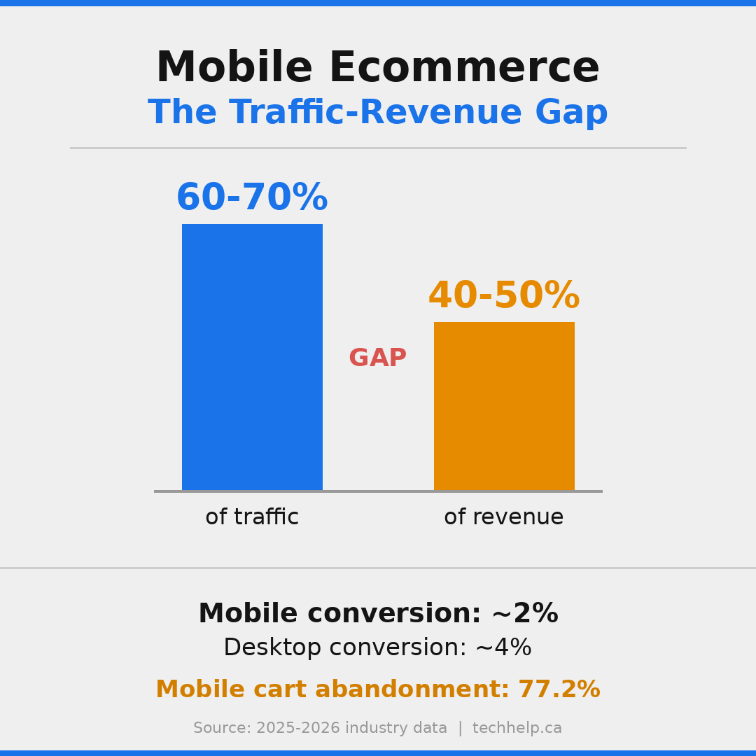
Responsive design ecommerce: rankings are only half the story#
Responsive design ecommerce work has two jobs. It has to help product and category pages rank, and it has to help mobile shoppers buy once they arrive.
Many ecommerce sites fall short on the buying experience. Baymard Institute’s long-running cart abandonment research puts the average documented cart abandonment rate at 70.22%. The reasons vary, but mobile friction makes common problems feel worse: surprise costs, forced account creation, slow pages, small form fields, unclear delivery details, weak return information, and checkout steps that feel longer than expected.
 Preview image
Portent’s site-speed research also shows how sharply conversion rates fall as load time increases. Across all sites in its study, one-second pages had the highest average conversion rate, with meaningful drops as pages moved from one to two to three seconds. For ecommerce, Portent found the highest conversion rates around one to two seconds.
 Preview image
For responsive ecommerce SEO, focus on the pages where rankings and revenue meet:
| Ecommerce page type | Responsive SEO priority |
|---|---|
| Category pages | Fast filtering, crawlable category content, useful internal links, stable product grids |
| Product pages | Responsive product images, visible price, reviews, shipping, returns, product schema, clear add-to-cart |
| Cart | Clear total cost, editable quantity, no layout jumps, trust signals, fast loading |
| Checkout | Fewer fields, mobile-friendly inputs, guest checkout, progress indicators, payment options |
| Search results | Fast internal search, useful filters, no dead ends, helpful empty-state pages |
Responsive design is the baseline. Ecommerce pages also need speed, product clarity, trust, and a checkout path that works under mobile conditions.
A mobile shopper is often distracted, moving between tabs, checking reviews, comparing prices, or using a weak connection. Your design has to reduce effort at every step.
How responsive website SEO affects content#
Responsive SEO isn’t only technical. Content presentation changes on mobile, and that changes how users read.
Long desktop sections can become overwhelming on a phone. Tables can become unreadable. Sidebars may move below the main content. Navigation may collapse. Calls to action may disappear below several screens of content.
That doesn’t mean mobile pages should be thin. It means the content needs to be structured for scanning and depth at the same time.
Use descriptive headings. Put the main answer near the top. Break long sections into readable chunks. Keep tables narrow or make them scroll responsibly. Place proof near the point where doubt appears. Keep internal links relevant. Make calls to action visible without interrupting reading.
If you’re working on SEO copywriting, responsive design changes the job. The words may be the same, but the reading experience isn’t. A paragraph that feels short on desktop can feel heavy on mobile. A CTA that appears near the top on desktop may be buried after a layout shift on mobile.
Content shouldn’t be removed for mobile. It should be organized so mobile users can move through it without fatigue.
How to audit responsive website SEO#
A responsive SEO audit should test the page the way Google and mobile users experience it. Don’t stop at whether the layout resizes.
Start with your highest-value pages: homepage, top service pages, top product or category pages, pricing, contact, booking, checkout, and high-traffic content. Then check each page across mobile and desktop.
1. Confirm Google can render the mobile page#
Use Google Search Console’s URL Inspection tool. Inspect the live URL and review the rendered HTML and screenshot. Check whether Google can see the main content, links, images, structured data, and layout.
If the rendered page is missing content or styling, look for blocked resources, JavaScript rendering issues, lazy-loading problems, or server rules that treat Googlebot differently.
2. Compare mobile and desktop content#
Open the page on desktop and mobile. Confirm that the mobile version includes the same important content and SEO signals:
| Element | What to check |
|---|---|
| Main copy | Same primary topic, offer, details, and proof |
| Headings | Same logical structure and topic coverage |
| Internal links | Priority links remain available on mobile |
| Metadata | Titles and descriptions avoid device-specific mistakes |
| Structured data | Schema is present and valid on mobile |
| Images and video | Important media load and have useful alt text or captions |
| CTAs | Primary actions remain visible and usable |
If the desktop page answers a question that the mobile page doesn’t, mobile-first indexing can work against you.
3. Test Core Web Vitals on mobile#
PageSpeed Insights is the easiest starting point. It shows field data from Chrome users when enough data exists, plus Lighthouse lab diagnostics.
Focus on mobile first. Check LCP, INP, and CLS. Then review the diagnostics behind each issue. The score is useful, but the fixes live in the details: image size, render-blocking resources, unused JavaScript, layout shifts, server response time, third-party code, and main-thread work.
Search Console’s Core Web Vitals report helps you find groups of similar pages that fail together. Performance problems often live in templates, not individual pages.
4. Check mobile usability manually#
Automated tools miss the feel of the page. Use physical phones when possible. Try to complete the main task with one hand.
Ask these questions:
| Task | What to watch |
|---|---|
| Reading | Is text readable without zooming? |
| Navigation | Can users find priority pages without guessing? |
| Forms | Are labels clear, fields large enough, and errors useful? |
| Checkout or booking | Can users finish without surprise costs or layout problems? |
| Search and filters | Can users refine options without losing context? |
| CTAs | Are primary actions visible when users are ready? |
| Interruptions | Do popups, banners, or widgets block content? |
If the page feels awkward to use, fix that before polishing minor design details.
5. Review responsive images#
Check whether images use `srcset` and `sizes`. Confirm that mobile users receive appropriately sized images. Look at hero images, product images, thumbnails, logos, background images, and blog graphics.
Also check image dimensions. Missing dimensions can cause layout shifts. Oversized images can slow LCP. Lazy loading can help lower-priority images, but lazy loading the main visible image can hurt the page.
6. Check internal links and navigation#
Responsive menus can hide important pages too deeply. Review the mobile navigation and make sure users can reach priority pages quickly.
Also check links inside the body content. Internal links help users continue their journey and help search engines understand page relationships. If useful desktop links disappear on mobile, the site loses both usability and internal linking value.
For larger sites, review XML sitemaps too. Tech Help Canada’s guide on creating a sitemap can help if your site structure has changed after a redesign.
7. Test accessibility#
Accessibility and responsive SEO overlap because both depend on usable structure. Check headings, labels, contrast, focus states, keyboard navigation, alt text, captions, and error messages.
Accessibility also affects mobile users who don’t identify as disabled. Captions help in noisy places. High contrast helps in bright light. Clear labels help rushed users. Large touch targets help everyone.
If you’re not sure where to start, our guide to web accessibility covers the core concepts.
Want a second set of eyes on your mobile SEO, Core Web Vitals, content parity, and crawl signals?
Responsive SEO checklist#
Use this checklist when launching, redesigning, or auditing a responsive website.
On smaller screens, this table becomes a stacked reference view.
| Check | Pass condition |
|---|---|
| Viewport tag | Every page has a proper viewport meta tag |
| Mobile-first content | Mobile pages include the same important content as desktop |
| Same URL | Priority pages use one URL across devices |
| Canonicals | Canonical tags point to the correct responsive URL |
| Rendering resources | CSS, JavaScript, images, and fonts are crawlable by Google |
| Core Web Vitals | Mobile LCP, INP, and CLS meet Google’s good thresholds |
| Images | Responsive images use correct sizing, compression, and dimensions |
| Navigation | Mobile menus expose priority pages clearly |
| Internal links | Important internal links remain available on mobile |
| Tap targets | Buttons and links are large enough and spaced properly |
| Forms | Fields, labels, errors, and inputs work well on phones |
| Popups | Interstitials don’t block the task or main content |
| Structured data | Schema is present and valid on mobile pages |
| Accessibility | Text, contrast, headings, labels, focus states, and keyboard access work |
| Analytics | Device segments, conversions, and page paths are tracked clearly |
 Preview image
This checklist is also useful before a website launch or redesign. Responsive problems are cheaper to fix before templates go live than after Google and customers have already found them.
Tools for responsive website SEO#
You don’t need a massive tool stack to audit responsive SEO. A few reliable tools cover most of the work.
Google Search Console shows indexing status, Core Web Vitals groups, page experience signals, mobile rendering through URL Inspection, sitemap issues, and search performance by query and device.
PageSpeed Insights combines CrUX field data with Lighthouse lab diagnostics. It’s useful for checking the mobile version of individual pages and identifying performance opportunities.
Chrome DevTools and Lighthouse let you emulate devices, throttle network conditions, inspect layout shifts, test accessibility, and debug JavaScript or rendering issues.
WebPageTest gives deeper performance testing, including filmstrips, waterfall charts, connection profiles, and repeat views. It’s especially useful when you need to understand why a page feels slow.
Screaming Frog or Sitebulb can crawl your site and flag metadata, canonicals, redirects, status codes, internal links, image issues, and structured data problems.
Physical devices still matter. Device emulation is helpful, but it can’t fully replace tapping through your site on actual phones with different screen sizes and network conditions.
The most useful workflow isn’t complicated: check Search Console for sitewide issues, use PageSpeed Insights for priority URLs, debug with DevTools or WebPageTest, then manually test the pages that drive leads or sales.
Common myths about responsive design and SEO#
Responsive design is widely recommended, but the advice around it often gets oversimplified. These are the myths that create weak decisions.
Myth 1: Responsive design automatically improves rankings#
Responsive design can remove technical barriers, but it doesn’t make weak content rank. You still need search intent match, useful content, internal links, backlinks, technical health, and a page that deserves to be chosen.
Responsive design helps Google access and evaluate your content. It doesn’t create value by itself.
Myth 2: If it looks good on mobile, it’s optimized#
Visual resizing is only one part of responsive SEO. A page can look good and still load slowly, shift around, hide important content, block Google from rendering resources, or bury the CTA.
Responsive SEO requires performance, content parity, rendering access, crawl clarity, and usability.
Myth 3: Desktop performance still carries the main SEO weight#
Desktop performance matters for desktop users, but mobile-first indexing means the mobile version is central to how Google evaluates the page. If your mobile version is weaker, the desktop version won’t fully save it.
Test mobile first. Then improve desktop.
Myth 4: You need a separate mobile site for speed#
A separate mobile site can be fast, but it adds technical complexity. A well-built responsive site can be fast without splitting URLs.
Speed comes from better templates, image strategy, caching, hosting, JavaScript discipline, and efficient implementation. It doesn’t require separate URLs by default.
Myth 5: Core Web Vitals are only a developer problem#
Developers play a major role, but business decisions often create the performance burden. Extra tracking scripts, heavy hero videos, unnecessary popups, large third-party widgets, bloated themes, and too many plugins are often business or marketing choices.
Responsive website SEO works best when marketing, design, development, and leadership all understand the trade-offs.
What to fix first#
If your site has many responsive SEO issues, start where the business impact is highest. You don’t need to fix every page at once.
First, check pages that already receive mobile search traffic but underperform in conversions. These pages have demand. The experience is failing to capture it.
Second, check pages with poor mobile Core Web Vitals. Focus on pages where LCP, INP, or CLS problems appear across a template. Fixing one template can improve dozens or hundreds of URLs.
Third, check mobile content parity on priority pages. If important desktop content is missing on mobile, fix that quickly.
Fourth, fix responsive image delivery. It’s often one of the fastest ways to improve page speed for SEO.
Fifth, review mobile forms and checkout. If users can’t contact you, book, subscribe, or buy, the ranking win will leak revenue.
Responsive SEO isn’t a one-time redesign task. It’s part of ongoing website optimization. Devices change, templates change, plugins change, scripts change, and Google keeps evaluating the version users experience.
Build for the version Google and customers use first#
Responsive web design isn’t a nice upgrade anymore. It’s the expected foundation for modern SEO.
Google primarily evaluates the mobile version of your content. Customers often do the same. A responsive site keeps your URLs, authority, content, and analytics together, but the design has to do more than resize. It has to load quickly, respond smoothly, stay stable, preserve important content, support internal links, work with assistive technology, and help users finish the task.
Responsive website SEO keeps your design aligned with how search works and how people browse now.
Start with your most valuable mobile pages. Test how Google renders them. Check Core Web Vitals. Compare mobile and desktop content. Fix the images, scripts, forms, menus, and interruptions that create friction. Then measure the result.
The payoff is bigger than rankings. You get a website that earns more from the attention you already worked hard to win.
If your mobile experience is costing you search visibility or conversions, we can help you find the highest-impact fixes.
Sources and references
- https://developers.google.com/search/docs/crawling-indexing/mobile/mobile-sites-mobile-first-indexing
- https://developers.google.com/search/docs/appearance/page-experience
- https://web.dev/articles/vitals
- https://httparchive.org/reports/chrome-ux-report
- https://cdn.httparchive.org/v1/static/reports/cruxPassesCWV.json
- https://gs.statcounter.com/platform-market-share/desktop-mobile-tablet/worldwide
- https://baymard.com/lists/cart-abandonment-rate
- https://portent.com/blog/analytics/research-site-speed-hurting-everyones-revenue.htm
- https://developers.google.com/search/docs/crawling-indexing/consolidate-duplicate-urls
- https://developers.google.com/search/docs/crawling-indexing/large-site-managing-crawl-budget
- https://developers.google.com/search/docs/crawling-indexing/301-redirects